With the world saturated with information, using data visualization to present numerical insights clearly and accurately is more critical than ever.
It’s is not just about creating aesthetically pleasing charts… it’s about transforming raw, complex datasets into compelling narratives that drive understanding and informed decision-making. Mastering these fundamentals is essential, whether you’re an analyst identifying business trends, a researcher sharing experimental results, or an educator explaining statistical concepts.
This guide moves beyond generic advice to provide a detailed list of actionable data visualization best practices. We will focus on techniques that ensure your charts are not only visually appealing but also statistically sound and easy to interpret. You will learn how to represent key statistical distributions with integrity and impact, a common task when working with tools like FiveNumberSummary.io to understand data spread.
1. Start with a Data Visualization Strategy
A strong data visualization strategy turns raw numbers into clear, actionable insights.
Instead of forcing teams to sift through spreadsheets or dense reports, visual formats like charts, dashboards, and graphs highlight patterns, trends, and anomalies at a glance. This clarity helps marketers, analysts, and decision-makers quickly understand what’s happening and why it matters.
The first step in building an effective strategy is defining the purpose of the data. Every visualization should answer a specific question, such as which campaigns drive the most conversions or how traffic changes over time. From there, choose visualization types that match the data:
- Line charts for trends
- Bar charts for comparisons
- Heatmaps for behavioral patterns
- And more
Consistency also matters. Using standardized colors, labeling, and layouts across dashboards ensures users can interpret visuals quickly without relearning the interface each time.
2. Choose the Right Chart Type for Your Data Distribution
Selecting the appropriate visualization is the foundational step in any data analysis narrative. The chart you choose dictates how your audience interprets the data’s structure, patterns, and insights. This choice is especially critical when communicating data distribution, as the wrong format can obscure key features like skewness, variance, and outliers. This is a core tenet of effective data visualization best practices.
When your goal is to display a five-number summary (minimum, first quartile, median, third quartile, and maximum), the box plot, invented by statistician John Tukey, is the gold standard. It provides a compact and powerful summary of a dataset’s central tendency and spread. However, other chart types also offer unique perspectives on distribution.
Vary Between Different Distribution Charts
- Box Plots: Use a box plot as your primary choice for comparing distributions across multiple categories. For instance, you could visualize exam score distributions for several different classes side-by-side, quickly identifying differences in median performance and score variability.
- Histograms: A histogram is ideal for understanding the shape of a single distribution. It groups data into bins and displays frequency, revealing whether the data is symmetric, skewed, or multimodal. This is useful for analyzing the frequency of sales figures within specific price ranges.
- Violin Plots: This chart combines a box plot’s summary statistics with a kernel density plot of the data. It provides more detail about the distribution’s shape and is excellent for showing software performance metrics across versions, where you might see multiple peaks in response times.
- Dot Plots (or Strip Plots): Use these to show every individual data point. They are most effective for smaller datasets, as they prevent oversimplification and reveal gaps or clusters that other chart types might hide.
Actionable Tips for Implementation
Key Insight: The right chart doesn’t just show the data; it reveals the story within the data’s distribution. The choice between a box plot and a histogram is a choice between summarizing comparisons and detailing a single dataset’s shape.
- Clarify Your Goal: Are you comparing groups or analyzing the shape of one group? Your answer is the primary guide to chart selection.
- Consider Audience Literacy: For audiences less familiar with statistics, a histogram or dot plot might be more intuitive than a box plot’s abstract representation.
- Supplement with Context: When comparing distributions, always include the sample size (n) for each group. A distribution based on 1,000 data points is more robust than one based on 10.
- Add Reference Lines: Enhance comparability by adding horizontal lines for a mean, median, or a specific benchmark value across your charts.
By carefully matching the chart type to your analytical goals and data structure, you ensure your visualization is not just accurate but also immediately insightful.
For a deeper dive into how data points form these patterns, you can explore tools like a frequency distribution calculator.
3. Emphasize the Five-Number Summary Components in Your Visualization
Once you’ve chosen a chart like a box plot, the next crucial step is to make its statistical components clear and understandable. A box plot inherently displays the five-number summary (minimum, Q1, median, Q3, and maximum), but simply showing the shape isn’t enough. Explicitly highlighting these values transforms the visualization from a mere statistical graphic into an intuitive and informative tool, a key principle of effective data visualization best practices.
By labeling these core metrics, you empower your audience, whether they are students, analysts, or managers, to instantly grasp the data’s central tendency, spread, and overall distribution without needing to guess or perform mental calculations.
The goal is to make the statistical story immediately apparent.
When and Why to Emphasize These Components
- Educational Settings: When teaching statistics, explicitly labeling the quartiles on a box plot showing exam scores helps students connect the abstract concept of quartiles to tangible performance brackets.
- Business Reporting: In a sales data visualization, marking the Q1 ($50K) and Q3 ($150K) thresholds provides clear targets and performance tiers for the sales team, showing where the middle 50% of deals fall.
- Quality Control: For a performance metric chart, highlighting the median benchmark for product defects allows teams to quickly assess if the current batch is performing above or below the historical standard.
- Comparative Analysis: When comparing multiple distributions, labeled medians and interquartile ranges (IQR) allow for precise, at-a-glance comparisons of both central tendency and variability between groups.
Key Insight: A well-labeled box plot doesn’t just present data; it teaches the viewer how to interpret it. By making the five-number summary explicit, you bridge the gap between statistical output and practical understanding.
- Label Key Values: Directly place numerical labels for the minimum, Q1, median, Q3, and maximum on your chart.
- Use Color for Distinction: Assign a contrasting color or heavier fill to the IQR box (the space between Q1 and Q3) to visually emphasize where the central 50% of your data lies.
- Add Interactive Tooltips: In digital visualizations, create tooltips that appear when a user hovers over a part of the plot, revealing the exact value and a brief description (e.g., “Median: 78.5”).
- Include Percentage Annotations: Consider adding text that explains what each quartile represents, such as “25% of data falls below this line (Q1),” to guide less statistically savvy audiences.
By making these components visually distinct and clearly labeled, you ensure your visualization is not only statistically sound but also exceptionally accessible. You can easily create and customize these visualizations with a dedicated box and whisker plot maker.
4. Use Color Strategically to Highlight Statistical Insights
Color is far more than an aesthetic choice in data visualization; it is a powerful analytical tool. When used strategically, color can differentiate categories, draw attention to significant data points like outliers, and guide the viewer’s eye to the most important parts of a statistical summary. This careful application of color transforms a simple chart into an intuitive narrative, making it a cornerstone of effective data visualization best practices.
Its primary role is to add a layer of information without adding complexity.
For instance, in a box plot, using a distinct color for the Interquartile Range (IQR) box versus the whiskers can visually separate the central 50% of the data from the rest of its distribution.
This helps audiences quickly grasp the core data spread.
When and Why to Use Strategic Color
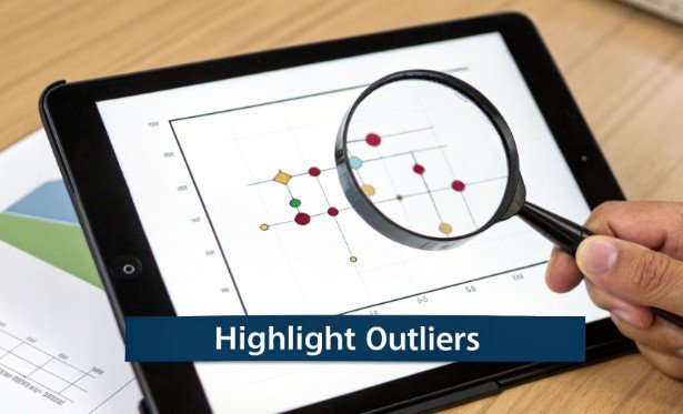
- Highlighting Outliers: Use a bright, contrasting color like red or orange to mark outliers. This immediately flags them as points of interest that deviate significantly from the rest of the dataset, prompting further investigation.
- Differentiating Categories: When comparing distributions side-by-side, such as exam scores across different classes, assign a unique and easily distinguishable color to each category. This makes cross-group comparisons effortless for the viewer.
- Emphasizing Key Ranges: Apply color to signify performance against a benchmark. For example, in a sales performance chart, data points above the median could be colored green, while those below are gray, providing an instant visual cue of success.
- Encoding Sequential Data: Use a sequential color palette (e.g., light blue to dark blue) to represent magnitude. This is effective for heatmaps or choropleth maps where color intensity corresponds to a numeric value.
Remember…
Key Insight: Color should serve a purpose. If a color doesn’t add new information or improve clarity, it’s just decoration that can potentially confuse your audience. Every hue should have a clear analytical job.
- Prioritize Accessibility: Use colorblind-safe palettes, such as Viridis or those found on ColorBrewer. This ensures your visualization is understandable to the widest possible audience.
- Limit Your Palette: Stick to a maximum of 3-4 distinct colors in a single visualization to avoid overwhelming the viewer. A muted or grayscale palette with one or two bright accent colors is highly effective for highlighting.
- Use Redundant Encoding: Don’t rely on color alone to convey information. Pair color with other visual cues like patterns, shapes, or labels to reinforce meaning and improve accessibility.
- Maintain Consistency: Ensure that a color representing a specific category or value remains consistent across all charts within a report or dashboard to prevent misinterpretation.
5. Include Clear Axes Labels and Statistical Annotations
A visualization without clear labels is like a map without a legend.
It shows a shape but provides no real direction or meaning.
Precise labeling of axes, including units and scale information, is a fundamental best practice that prevents misinterpretation and supports immediate understanding. This practice is crucial for transforming a simple chart into a credible analytical tool, which is a key goal of data visualization best practices.
For visualizations that summarize data distributions, such as box plots based on a five-number summary, annotations are not just helpful, they are essential. Directly labeling key statistical values like quartiles, the median, and the sample size (n) empowers your audience to grasp the data’s story without needing to guess or consult supplementary documents.
Don’t Forget Detailed Annotations
- Box Plots and Distribution Charts: Always annotate box plots with the specific values for the median, first quartile (Q1), and third quartile (Q3). Including the sample size (e.g., “n=250”) adds crucial context about the robustness of the data. For an exam score box plot, this means labeling “Median: 85” directly on the chart.
- Time-Series Graphs: Label the x-axis with clear time units (e.g., “Month,” “Fiscal Quarter 2023”) and the y-axis with the measured unit (e.g., “Revenue (in USD Millions)”). This removes all ambiguity about the scale and scope.
- Bar Charts Comparing Categories: When bars represent complex metrics, like average transaction value, the y-axis label must be explicit: “Average Transaction Value ($)”. Annotating specific bars with their exact values can highlight key data points.
- Scientific and Academic Visualizations: In these contexts, credibility is paramount. Including data sources, collection dates, and calculation methods via footnotes or subtitles is standard practice.
Being Able to Visualize Numerical Data on Charts
Key Insight: Annotations and clear labels transform a chart from a piece of art into a piece of evidence. They provide the necessary context for your audience to trust your data and understand your conclusions without assistance.
- Be Explicit with Units: Place units directly within the axis title, such as ‘Response Time (ms)’ or ‘Temperature (°C)’. This is clearer than adding a separate note.
- Label Key Statistical Points: For a box plot showing sales data, directly add text labels like ‘Q1: $45K’, ‘Median: $85K’, and ‘Q3: $165K’ to the corresponding parts of the plot.
- Cite Your Sources: Add a small note below the chart indicating the data source and the date of analysis (e.g., “Source: Company CRM, Data as of Q4 2023”). This builds trust and transparency.
- Use Highlighting Strategically: Make the median line visually distinct with a bolder color or thicker stroke and label its value to draw immediate attention to the central tendency.
6. Optimize Scale and Axis Ranges for Accurate Representation
The scales and axes of a chart are its structural backbone, defining the canvas upon which data is presented. Manipulating these elements, whether intentionally or accidentally, can drastically alter the story your visualization tells. Choosing appropriate axis ranges is fundamental to honest data representation and is a critical aspect of effective data visualization best practices.
Truncated axes, where the scale does not start at a natural zero point, can exaggerate minor differences and mislead viewers. Conversely, an overly expansive range can flatten significant variations, making them appear trivial. When visualizing five-number summary data with box plots, the axis range directly influences how the audience perceives the interquartile range, overall spread, and the significance of outliers.
Adjust Axis Ranges
- When comparing distributions: Use consistent axis ranges across multiple charts (e.g., box plots for different product versions) to ensure a fair, apples-to-apples comparison. This allows the audience to accurately judge differences in medians and spreads without being misled by varying scales.
- When showing absolute magnitude: For bar charts or other visualizations where the length of the bar represents a total quantity (like sales figures), always start the axis at zero. Violating this rule is a common way to misrepresent data, as famously detailed in Darrell Huff’s “How to Lie with Statistics.”
- When focusing on specific variance: If you are visualizing data that naturally occurs within a narrow band far from zero, like exam scores from 60-100, truncating the axis can be justified. However, this must be clearly labeled and explained to avoid creating a false impression of volatility.
Actionable Tips for Implementation
Key Insight: An axis is a promise of proportionality. Changing the scale or starting point breaks that promise and compromises the integrity of your visualization, turning an honest insight into a potential deception.
- Start at Zero (Usually): For non-negative data representing magnitude (e.g., revenue, population), begin your vertical axis at zero. If a non-zero baseline is necessary for clarity, make it obvious with clear labeling.
- Maintain Consistency: When placing similar charts side-by-side for comparison, lock the axis ranges. This ensures visual differences directly correspond to data differences.
- Incorporate Outliers Thoughtfully: If outliers stretch your axis and compress the main data distribution, consider techniques like a log scale or a broken axis. However, use these sparingly and always label them explicitly, as they can be difficult for some audiences to interpret.
- Validate with Experts: Test your chosen axis ranges with domain experts. For example, a 1% change in a key financial metric might be monumental, justifying a narrow axis, while a 10% change in user engagement could be normal noise.
7. Enable Comparison Across Multiple Distributions or Time Periods
A single visualization is useful, but the power of data analysis is often unlocked through comparison. The ability to place multiple distributions side-by-side, such as different product categories, sales regions, or time periods, allows an audience to instantly grasp relative performance and identify significant variations. This comparative approach is a cornerstone of effective data visualization best practices, transforming isolated data points into a cohesive analytical narrative.
By juxtaposing multiple five-number summaries or distributions, you provide the context needed for meaningful interpretation.
Viewers can quickly spot which groups have higher medians, greater variability, or more frequent outliers…
All without having to toggle between different views. This technique, popularized by pioneers like Edward Tufte through concepts like “small multiples,” is essential for creating high-density, information-rich dashboards and reports.
Use Comparative Visualizations
- Comparing Categories: Use side-by-side box plots to compare the distribution of key performance indicators across distinct groups. For example, visualize sales performance distributions for 10 regional offices to see which regions are most consistent and which have the highest top-end sales.
- Tracking Over Time: To show how a distribution evolves, place visualizations for different time periods next to each other. This is ideal for showing how software performance metrics, like the interquartile range (IQR) of response times, have changed across multiple version releases.
- A/B Testing Analysis: When analyzing the results of an experiment, comparing the distribution of outcomes for the control group versus the test group can reveal not just a change in the average but also changes in variance and skewness.
Keep In Mind:
Key Insight: The goal of comparison is to make differences and similarities obvious at a glance. Consistency in scale, color, and layout is not just an aesthetic choice; it is a functional requirement for accurate interpretation.
- Maintain Identical Axis Ranges: The most critical rule for comparison is to use the same scale and axis range for all charts. Mismatched axes can dramatically distort perceived differences and mislead the viewer.
- Order Groups Logically: Don’t leave the order of your groups to chance. Sort them in a way that reveals a pattern, such as chronologically, alphabetically, or by a key metric like the median value.
- Use a Consistent Color Scheme: Assign colors intentionally. Use a single color for all distributions to emphasize shape comparison, or use a categorical palette to distinguish between specific groups, but keep it consistent.
- Add Global Reference Lines: Enhance comparability by adding a reference line that shows the overall mean or median across all groups combined. This helps viewers quickly assess which groups are above or below the general average.
8. Identify and Appropriately Display Outliers
Outliers are data points that deviate significantly from the rest of a dataset, and their proper handling is a critical aspect of honest data representation.
These values can represent measurement errors, data entry mistakes, or genuinely rare events. A core function of a five-number summary and its visual counterpart, the box plot, is to systematically identify these anomalies, making this one of the most important data visualization best practices.
Ignoring or improperly visualizing outliers can lead to skewed interpretations and flawed conclusions.
By highlighting them, you provide a more complete and transparent view of the data’s structure, signaling to the audience that these points warrant further investigation. This prevents misinterpretation and ensures that decisions are based on a full understanding of the data’s nuances.
When and Why to Highlight Outliers
- Error Detection: Use outlier visualization to quickly spot potential errors in data collection or entry. For example, a student’s exam score recorded as 150% is clearly an error that needs correction.
- Identifying Key Events: In business analytics, an outlier might represent a fraudulent transaction, a major sales event, or a server outage. Highlighting it directs attention to a critical incident that requires analysis.
- Ensuring Model Accuracy: When preparing data for statistical modeling, identifying and deciding how to treat outliers is crucial. Visualizing them is the first step in assessing their potential impact on a model’s performance.
- Performance Analysis: An experimental run with an anomalously high or low measurement could indicate either a breakthrough discovery or a flawed procedure. Displaying it as an outlier ensures it gets the necessary scrutiny.
Actionable Tips for Implementation
Key Insight: Outliers are not noise to be discarded; they are signals to be investigated. Your visualization should treat them as such, distinguishing them from the main distribution without hiding them.
- Use a Standard Definition: Apply a consistent statistical rule for identification, such as John Tukey’s method, which flags any point below Q1 – 1.5×IQR or above Q3 + 1.5×IQR.
- Visualize Them Clearly: In box plots, outliers are automatically shown as distinct points. In other charts like scatter plots, use a different color, shape, or size to make them stand out.
- Provide Context: Use tooltips or annotations to offer more information about an outlier. Explain what the value is and, if known, why it is an outlier.
- Investigate, Don’t Delete: Before removing an outlier, determine its cause. Is it a typo, a measurement error, or a valid but extreme value? The story behind the outlier is often the most important insight. For an easy way to find these values, you can use an online IQR calculator.
9. Provide Context Through Titles, Legends, and Supporting Text
A visually appealing chart is only half the battle; without proper context, it remains a piece of abstract art rather than a tool for insight. Effective visualizations require a framework of titles, legends, and explanatory text that tells the viewer what they are seeing, why it is important, and what conclusions to draw. This layer of information transforms a raw chart into a complete narrative, a crucial component of data visualization best practices.
From a clear title stating the chart’s purpose to a simple caption highlighting a key finding, this supporting text guides your audience’s interpretation. For analytical and educational settings, such context is non-negotiable, as it underpins both comprehension and sound decision-making based on the data presented.
When and Why to Use Supporting Text
- Descriptive Titles: Use a specific title to immediately orient the viewer. Instead of a generic label like ‘Exam Scores’, a title such as ‘Q3 Exam Scores by Class Section (Fall 2024)’ provides essential context on the what, who, and when.
- Clear Legends: A legend is critical for decoding charts with multiple series or categories. Place legends intuitively, often adjacent to the data they represent, to prevent the viewer’s eyes from darting across the page. This is vital when comparing box plots for different sales regions.
- Annotations and Captions: Use annotations to point out specific data points of interest, like a significant outlier or a target benchmark. A concise caption below the chart, such as ‘Median score of 78 falls below the district benchmark of 82’, can summarize the main takeaway.
- Subtitles for Nuance: Add a subtitle to provide secondary information like the sample size (n=…), data source, or the time period covered. This adds a layer of credibility and detail without cluttering the main title.
10. Design for the Audience and Their Statistical Literacy Level
An effective visualization is not designed in a vacuum…
It is a conversation with a specific audience.
The chart’s complexity, annotations, and even the choice of statistical measures must align with the viewer’s knowledge and decision-making context. Failing to consider your audience’s statistical literacy can render a perfectly accurate chart useless, or worse, misleading. Tailoring your approach is a cornerstone of advanced data visualization best practices.
The principles of user-centered design, popularized by figures like Don Norman, apply directly here. A visualization built for a team of data scientists will look fundamentally different from one presented to a board of executives, even if it uses the same underlying data. The goal is to bridge the gap between the data’s complexity and the audience’s ability to comprehend it.
When and Why to Tailor Visualizations
- For Statistics Students: Use a detailed box plot that explicitly labels the median, quartiles, and interquartile range (IQR). You might include formula notations and textual explanations to reinforce statistical concepts being taught. The goal is educational and comprehensive.
- For Business Executives: Present a simplified five-number summary or a high-level bar chart. Focus on the key takeaway by highlighting the median and the overall range, and use annotations to translate statistical terms into business impact (e.g., “Median response time decreased by 15%”). The goal is quick, actionable insight.
- For Scientific Researchers: A technical box plot is appropriate, but it should be augmented with relevant statistical test results, such as p-values or confidence intervals. The visualization serves as evidence supporting a hypothesis, so precision and statistical rigor are paramount.
Key Insight: The most successful visualizations are not the most complex, but the most comprehensible to their intended audience. Clarity for the user should always trump technical complexity.
Actionable Tips for Implementation
- Research Your Audience: Before you begin designing, ask about their familiarity with charts like box plots or histograms. What decisions will they make based on this data?
- Use Progressive Disclosure: Design a main summary view for a general audience, with options to drill down into more detailed statistical layers for expert users.
- Include a Mini-Glossary: If presenting to a mixed-literacy audience, add a small, accessible glossary defining key terms like “median” or “quartile” directly on the dashboard or slide.
- Test Your Visualization: Share a draft with a few members of your target audience and ask them what they understand from it. Their feedback is invaluable for refinement.
The principles of good design extend beyond data visualization itself, encompassing the overall user experience.
Top 10 Data Visualization Best Practices Comparison
| Item | Implementation Complexity 🔄 | Resource Requirements ⚡ | Expected Outcomes 📊 | Ideal Use Cases 💡 | Key Advantages ⭐ |
|---|---|---|---|---|---|
| Start with a Data Visualization Strategy | Medium 🔄 — define purpose, select chart types, standardize layouts | Low–Medium ⚡ — planning and alignment effort | Clear, purposeful visuals that answer specific questions 📊⭐⭐⭐ | Team dashboards, campaign analysis, ongoing reporting | Aligns visuals to goals; ensures consistency across outputs |
| Choose the Right Chart Type for Your Data Distribution | Medium 🔄 — choose appropriate plot and parameters | Low–Medium ⚡ — common libraries (box/hist/violin) | Clear distribution view; good group comparisons ⭐⭐⭐ | Single distribution inspection; multiple-group comparison; quartile/outlier focus | Matches visualization to data; reveals spread and outliers |
| Emphasize the Five-Number Summary Components in Your Visualization | Low–Medium 🔄 — add labels/annotations | Low ⚡ — annotation tools only | Immediate understanding of quartiles and extremes 📊⭐⭐⭐ | Teaching, explanatory reports, dashboards | Makes statistical story explicit; reduces need for external explanation |
| Use Color Strategically to Highlight Statistical Insights | Low 🔄 — select palettes and encodings | Low ⚡ — color palettes and accessibility testing | Faster pattern recognition; improved engagement 📊⭐⭐⭐ | Multi-group comparisons; outlier highlighting | Distinguishes groups and elements; improves accessibility if chosen well |
| Include Clear Axes Labels and Statistical Annotations | Low 🔄 — label placement and formatting | Low ⚡ — authoring effort for text | Eliminates ambiguity; supports reproducibility 📊⭐⭐⭐ | Academic publishing, technical reports, instruction | Improves credibility and interpretability |
| Optimize Scale and Axis Ranges for Accurate Representation | Medium 🔄 — choose/justify scales and breaks | Low ⚡ — testing and possible insets | Honest representation; avoids visual distortion 📊⭐⭐⭐ | Comparative charts; data with outliers or wide ranges | Preserves integrity; consistent comparisons across charts |
| Enable Comparison Across Multiple Distributions or Time Periods | Medium–High 🔄 — layout, consistent scales, sorting | Medium ⚡ — more design and space requirements | Reveals patterns/trends across groups or time 📊⭐⭐⭐ | Dashboards, comparative studies, time-series distribution analysis | Facilitates rapid relative comparison; efficient space usage (small multiples) |
| Identify and Appropriately Display Outliers | Low–Medium 🔄 — apply detection rule and marking | Low ⚡ — marker styling and tooltips | Highlights anomalies for investigation 📊⭐⭐⭐ | Quality control, diagnostics, anomaly detection | Draws attention to unusual observations; aids root-cause analysis |
| Provide Context Through Titles, Legends, and Supporting Text | Low 🔄 — craft concise explanatory text | Low ⚡ — writing and placement effort | Self-contained visuals; reduced misinterpretation 📊⭐⭐⭐ | Reports, educational materials, standalone visuals | Guides viewer attention; explains significance and scope |
| Design for the Audience and Their Statistical Literacy Level | Medium 🔄 — audience research; tiered versions | Medium ⚡ — user testing, multiple variants | Appropriate comprehension and engagement 📊⭐⭐⭐ | Mixed audiences, education vs. executive reporting | Tailors complexity; improves retention and relevance |
Putting It All Together: Your Next Steps in Data Visualization
We have journeyed through ten foundational principles designed to elevate your charts and graphs from simple data displays to powerful communication tools. Mastering the art and science of data visualization is an ongoing process of refinement, practice, and thoughtful application. By consistently applying these data visualization best practices, you empower yourself to move beyond merely showing numbers and begin to truly communicate insight. The goal is no longer just to present data, but to guide your audience to a clear, accurate, and actionable understanding.
The core principles we’ve discussed can be distilled into a few essential themes: clarity, context, and consideration for the audience. These are not isolated rules but interconnected concepts that build upon one another to create compelling and honest visual narratives. From selecting the appropriate chart type, like a box plot for distributions, to the strategic use of color and precise annotations, every choice you make influences the final interpretation.
Key Takeaways for Effective Visualization
Reflecting on the best practices covered, several key ideas stand out as critical for immediate implementation:
- Purpose Before Polish: Before you even think about colors or fonts, your primary focus must be on selecting the right visualization for the story you need to tell. A bar chart is not a histogram, and a line chart is not a scatter plot. Understanding the unique strengths of each, especially how a box plot reveals a five-number summary, is the most crucial first step.
- Honesty in Representation: Your responsibility as a data communicator is to present the truth without distortion. This means starting your axes at zero where appropriate, choosing scales that don’t exaggerate or diminish trends, and handling outliers transparently. Misleading visualizations erode trust and can lead to poor decision-making.
- Context is Everything: A chart without context is just abstract art. Clear titles, descriptive axis labels, concise annotations, and a well-placed legend are not optional extras. They are essential components that provide the framework your audience needs to correctly interpret the information presented. Without this supporting text, your visualization is incomplete.
- Design for the User: Always remember who you are creating the visualization for. A dashboard for a technical analyst will look very different from a presentation slide for a board of directors. Tailoring the complexity, density of information, and level of statistical detail to your audience’s literacy and needs is a hallmark of effective data visualization best practices.
Your Actionable Path Forward
Theory is valuable, but practice is where true mastery is forged.
To translate these concepts into tangible skills, we encourage you to take concrete, deliberate steps with your very next dataset. Don’t feel pressured to implement all ten practices at once. Instead, focus on a few and build from there.
Here is a simple, structured approach to get started:
- Start with the Fundamentals: Take a dataset you are familiar with, perhaps recent sales figures, website traffic data, or student test scores. Before creating any charts, calculate the core descriptive statistics. Understanding the minimum, maximum, median, and quartiles gives you an immediate, foundational understanding of its distribution.
- Visualize the Distribution: With your five-number summary in hand, your first visualization should be a box plot. This single chart will immediately put several best practices into play. It forces you to think about the distribution, scale, potential outliers, and the core statistical summary of your data.
- Iterate and Annotate: Create your initial box plot, then critically review it. Ask yourself: Is the title clear? Are the axes labeled properly? Does it need an annotation to explain the median or an outlier? Apply the principles of strategic color use and simplicity to refine it.
- Seek Feedback: Share your refined visualization with a colleague or peer. Ask them what story the chart tells them. Their feedback is invaluable for understanding if your intended message is being received clearly and accurately.
By committing to this cycle of analysis, creation, and refinement, you will steadily internalize these data visualization best practices. Each chart you build becomes an opportunity to hone your skills, making you a more effective, ethical, and impactful data storyteller. The value of this skill cannot be overstated; it transforms complex data into shared understanding, drives informed decisions, and empowers organizations to see their world more clearly.